Category Archives: FAQ Art & Pastel

Is pastel powder disconcerting?

ME0000029180_3

Question:

Very much drawn to pastels, I’m still hesitating to use them as I find the instability of the powder slightly disconcerting (like water in water colours)

Answer:

Painting is a practice of the physical kind, empirical, and the more we ask ourselves questions before using it, the more we put off confronting the material, this union of artist and medium that is indispensable in creating a work of art.

But the physical and mental aspects involved have an equal influence over each other and perhaps for the moment you are going through an expectative period where an artist instinctively feels an impulse towards the right material but doesn’t dare to put it to the test as you feel you are not quite ready; a bit like postponing an encounter with something that we hold sacred! In the meantime, all kinds of materials can act as a basis for an apprenticeship in the quest for truth and it might just be that one day that will be pastels.

The instability of the powder, the instability of water, opens up the way for an adventure in artistic exploration… a land of discovery, a world just ready for the taking …

Feeling like you can’t master the effects.

Just as the artist dominates the material so the material dominates the artist, and artistic production comes about through this perpetual jousting. It is true that with pastels, the artist has the impression of accommodating and adapting the material rather than mastering it!

But isn’t it just this state of acceptation and availability that allows the artist to progress in the technique, to penetrate its secrets and sometimes to the point of finding inspiration in it? By wanting too much control we run the risk of not being able to reinvent ourselves!

Soft pastel is made up of pigments almost in their pure state as they have only been very slightly modified by nature or by the binding agent or other additive, which is very rare occurrence in pictorial art! This specificity is what makes pastel powder so unusual: a heavy touch of matter nevertheless adheres to the pores of the support by nothing more than a thread! The powder is light, volatile, but in fine layers it sticks relatively well to the support and the mark it leaves, once blended, has the persistent tenacity of pigments!

The instability of pastel powder gives the artist the impression of losing a grasp on reality, slipping into a vaporous and misty area. Especially as the capricious powder has the atmospheric power of moving from abruptly and irremediably buried lighting effects to magical ones springing out of a certain body language purely by chance!

We learn then to work and create with the material, and in new ways, given the wide diversity of textures that the rich pigments of pastels induce In this way, the powder’s instability prepares the artist for adventure.

Pastel, primary material, carries a diversity of resources in gestation:

Sticks offer the direct intensity of their pure colour. Depending on the pressure applied to the stick, the colour can either have the lightness of a breath enabling the grain of the paper to show through, or can be more or less concealing and opaque.

Two superimposed colours do not always result in exactly the desired nuances, but on the contrary often surprise us by creating tonalities with an unexpected brightness. Colours that have been spread out can be blended by shading.

The edge of the stick can be used for all kinds of graphics. When superimposed, the lines leave the way open for optical effects of both matter and depth.

And pastel hasn’t yet revealed how it lends itself perfectly to mixed techniques! Through highlighting, the pastel lines generously nourish the work with their rich texture. When in contact with mediums that have a good level of adherence to the support, pastel consolidates itself rather like an incandescent parasite!

Moreover, pastel is a medium whose facture is just as expressive in drawing as it is in painting! Some lines on a sheet of paper and the opulence of substance, intensity of colour, vibrations of light spring forth. Powerful are the lines of a spartan pastel drawing! Just like paint in painting, when the powder completely covers the support, the excess of rich matter risks at worst, annihilating itself.

Here are some innovative examples from works by painters with an intimist sensibility: Chardin, Degas, Redon, Rouault.
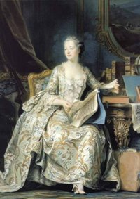
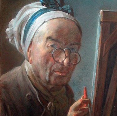
Jean Siméon Chardin

Self-portrait in crayon, 1775 – 1779. Pastel on blue paper.
The Louvre, Department of Graphic Arts (Image taken from www.insecula.com)

“We use colours but we paint with emotion!” ChardinChardin, who came to pastels late in life, had the authority to take it by storm with complete impudence, countering the seductive and refined texture of the academic style of pastel painting seen during the eighteenth century, wanting to show instead the hierarchical equality of pastels with oil painting. (Rosalba Carriera, Quentin de la Tour, Perroneau, Liotard …)Chardin’s “emotion” must have been very powerful given the force of his highly individualised touches of pastel, left in their raw state, thick, square, and juxtaposed with unblended surfaces, unique to the palpitation of a pigmented grain.

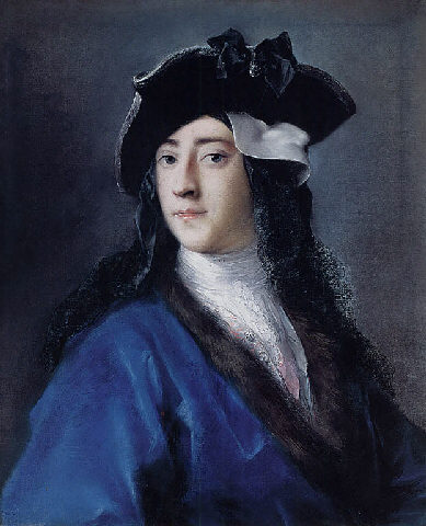
Chardin’s technical innovations were almost certainly linked in part to his ever-diminishing sight, which he compensated for, by using some audacious effects of colour and material. For the same reasons, Degas also unleashed himself through pastels.

This meditative self-portrait, very much in half-light, is one of his last works. The gaze, already detached from the world, nevertheless meets the spectator’s gaze with determination in a benevolent sign of transmission. Crushed fragments of vermillion red on the artist’s hands and on parts of his face, contrasted with green and blue glimmers, are pre-cursors of Fauvism and the colorists of modern painting from Jawlenski to de Staël.

And highlighted in the portrait, coming out of the artist’s hand, the ardent red of this pastel stick, charged with a fervent silence like a hand lit by a candle in a work by Georges de La Tour! Pierre Rosenberg (art historian) commented on the symbolism of this stick “In his last pastel, Chardin uses a single red spot to represent a colour crayon. A way of saying: right up until the end, that’s how I’m going to express myself.”

Edgar Degas

Woman Drying her Hair, pastel, around 1905-1910
71.1 x 62.2 cm, Norton Simon Foundation, Pasadena
(
Image taken from “Degas, Nudes” by Richard Thomson. Nathan)

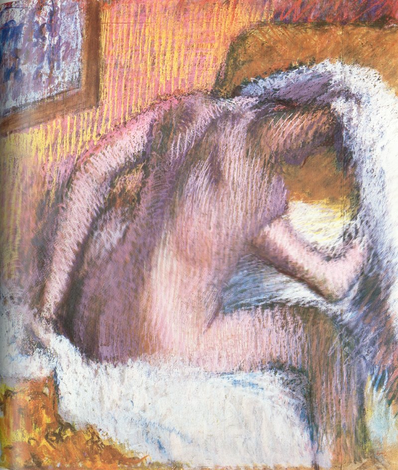
The substance of Degas’ pastels is created through lines, drawing being primordial in his work. Degas is able to multiply the superposition of pastel powder because he fixes every layer. Networks of lively hatching, tangled up by way of the superpositions, create depth, transparencies, pearly reflections, a full luxurious thickness just like the flesh tamed with bright highlights of his later nudes.

The nude observed here appears to go beyond the dissonant boundaries of the colours customarily used by the painter. Degas, with his fading vision, frees himself from notions of perfecting this model whom he had already painted in numerous series to the point of saturation! Notice to what extent the frantic strokes of milky pastel shine on the hatched grain of the dark half-tints of the primers.

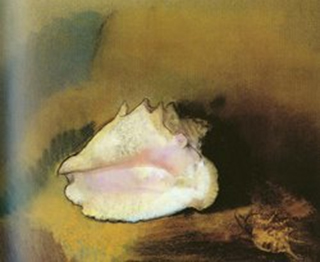
The nude thus finds all of it resonant autonomy and the two pieces of the white towel open up like a seashell on the rosy pink thigh of a nymph, clashing on the salmon background, with its pink and yellow hatching, of the wallpaper!

Odilon Redon

Joan of Arc, around 1900 Pastel, 27.5 x 52 cm.
Musée d’Orsay, Paris (Image taken from “Redon” by Taschen, 1995)

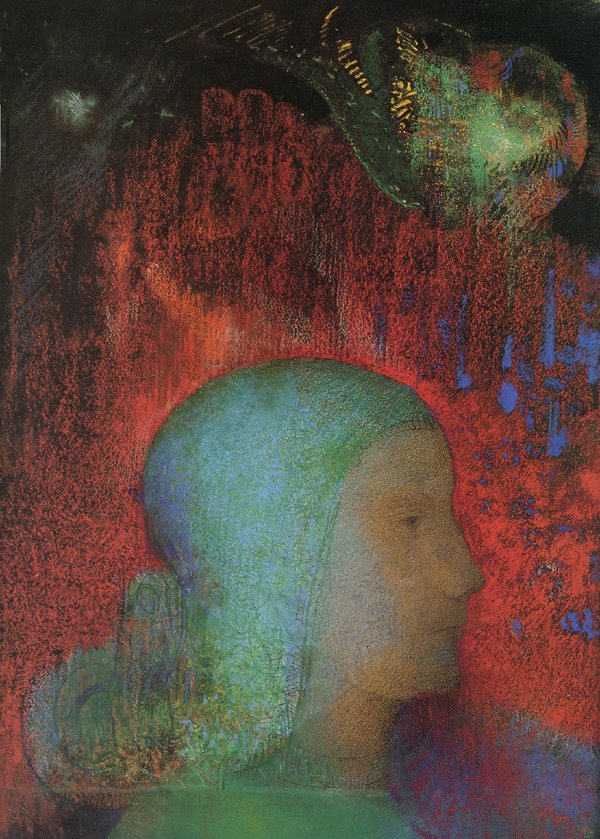
The unsure contours of works done in pastels suit Redon, an inward-looking painter. Fleeting, evocative effects, diffused modelling, ephemeral texture. “My drawings inspire and do not define themselves. They do not determine anything. They put us, just like music, in the ambiguous world of the indeterminate”

In Redon’s work the pastel gently brushes the support. This is the case in this symbolic portrait of Joan of Arc. One layer of freehand pastel is enough to make the colour vibrate.

The Cadmium red powder laid on the black paper support, contrasted in the interstices with some touches of ultramarine and brightened by a bit of yellow in places, ripples with light; the red becomes a forest of magma from which is cut out the impassive profile of the subject topped with a chignon abundant with phosphorescent tracery chiselled out like leaves on a stained glass window, (is there a divinity meditating there?) finally veiled by the blending and a dusting of sulphate!

Moreover, the simplicity of the composition is exactly what gives the work its intemporality. A profile emerging from a fresco by Piero della Francesca or a modern day comic book? The bubble, blown like glass, in pastel that hasn’t fused together, directly onto the black background, gleams like a crystal ball; descending from the depths of the sky like a cosmic fish!

Georges Rouault

A Tabarin, 1905 – Watercolour and pastel, 71 x 55 cm.
Museum of Modern Art, Paris
(Image taken from “Rouault” by Bernard Dorival, Flammarion 1992)

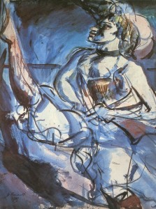
Pastel really works well when used with other techniques. It brings out the best in other them, whether it be heightening or a mix of methods. In addition, when mixed with other mediums, notably aqueous ones, the pigments have an even better adherence to the support.

“A Tabarin” is a spirited work, created in a farandole of powder and water. On the crest of the wave, the ferocity of the dancer surges forth in a whirling latticework of watercolour and a scattering of Blue Persian and mauvish-red pastel.

The pastel balances out this flight of lyricism sometimes with little puddles of watercolour, sometimes covering up areas of watercolour in certain places, with nervous highlighting. The two mediums soak each other up to the point where they melt into one, except where the pastel is spread out very thinly on the white areas of the paper.


Pastel and details

Aren’t pastel crayons or chalks the tools needed for fine detail?

Pastel can lend itself to details depending on the artist’s technique. For example if the layers of pastel are fine or blended out they will happily accept a powder complement. If the surface is worked in lines, it will naturally bring out the details based on the superposition of the network of layers.

Fixing pastel, of course, allows the artist to make some very detailed creations. Quentin de la Tour reached the heights of virtuosity in both material and textural detail, cf. below the pastel portrait of Madame de Pompadour. Format 1.75 x 1.28 m. The composition of the very high-quality fixative used by the pastel artist is not known.

Moreover, there are other alternatives, dialogues between the artist and the material that can feed the work, proliferate without necessarily creating an accumulation of detail. Cf. the pastel by Vuillard, Place Vintimille: we can imagine the rippling of the material, continually renewed, in the grain of the rapidly-dispersed powder and in the facture of the stick’s powder that spreads out or becomes porous rather like cartilage.

The impetuousness of the lines succeed in nourishing, enriching the pastel as if it were extremely detailed! Extremes sometimes work well together!

In addition, this resorting to mixed techniques (mixed techniques = using more than one type of technique to create a work) enriches pastel and consequently strengthens the details. See below some examples of pastels worked with gouache, chalk, pencil.

Gouache

The drawing techniques of the Renaissance period such as sanguine or black chalk, highlighted with gouache, suit pastel. The light accents of paint used in these works reinforces the colour of eighteenth century pastels. Rosalba Carriera, one of the first portrait artists, gave this flattened kind of detail relief in her highly blended pastels, ornamenting a neckline or a tie, by using bright touches of white gouache.


Portrait of Gustavus Hamilton, 2nd Viscount Boyn by  Rosalba Carriera. 1730 – 1731.
Pastel son paper mounted on canvas. 42.9 x 56.5 cm.

Chalk

Slightly waxy chalks, like sanguine or graphite, adhere well to pastel. In addition, the sharp edge at the tip or the ridge of the stick lends itself perfectly to fine detailing.

Pencils

In theory, pencil lines are a good structural complement to the indecisiveness of pastel powder. Pastel crayons lack body and contrast to be used for very precise detailed lines. Lead pencil is the most resolute.

MILLET Noonday Rest, 1866. Lead pencil and pastel on laid paper. 29.2 x 42 cm.
Museum of Fine Arts, Boston. Owner Don Quincy Adams Shaw.
Beautifully contrasting with the light, the shadows, the deepened lines of lead pencil.


Paul SERUSIER Landscape, 1912. Coloured crayons and pastel on grey papers.
The marriage of coloured crayons and pastels on grey paper provides a softness to the work and brings fervour to the dynamic of the grasses and foliage.
Conclusion

Detailing done in pastel keeps the individual spirit of the material. Pastels are perfect for indecisiveness! The colour, that appears to be levitating, breathes a sort of noble distance into the work. The powder is still there, in the intimacy of its sensuality, but at the same time it remains secret, distant, resisting precision; the velvety fleetingness of a dream, it flickers towards a subtle ‘elsewhere’ somewhat like dust in the rays of the sunlight …


Pastel by Odilon Redon, Interaction between the background and the subject in painting (1)

“The Shell”,1912, Pastel, Odilon Redon, 52×58 cm, Musée d’Orsay, Paris
(Reproduction scanned from the album “Redon” by Taschen)

The Shell, is a pastel work by Odilon Redon, painted from a shell belonging to his wife. This object inspired the painter to do a number of variations on the theme of the birth of Venus. There is no naked figure emerging from a conch shell in this pastel, but there is perhaps the promise of a birth. The work was only revealed to the public after the artist had died.

The reproduction of this pastel doesn’t make it easy to imagine the original shade of the paper as it is powdered with muted tones of earthy yellow ochre, brown ochre, green clay. In places however, we can almost imagine through the grain, that the colour of the paper is an indistinct grey. Moreover, the position of the shell seems to have been especially reserved for it in order to give the impression that the subject bursts out of the virgin background without warning.

And so might the filigreed substance of a dried insect’s wing, and especially on the upper lip of the shell, emanate from scratches of white pastel onto an area of paper not covered in pastel, and therefore rough. In contrast, heavy droplets of white pastel are spread here and there, mineralising the shell’s fragile structure. Set between the two half-open lips of the shell, generated by a reddish mauve that is at the source of two misty atmospheric shadings, an area of flat white tint. This area looks like it’s been cut out of stone and echoes the rusticity of a Romanesque sculpture of a child swaddled in a crib. Another flat white area glides, like a moving curtain, over the sun-bathed resonances of the lower lip until it loses itself in the blue-tinged edge.

To exalt the luminosity of the chalice, the golden brown harmonies of the background are enhanced and enshroud it with a halo. The purplish-blue projected shadow, deepened with black, propels the mother-of-pearl effect from its exterior point, a rough protuberance worked in half-tints of grey over the powdery obscured background. An umber brown caterpillar climbs up the bright mountain slope, and the sharp black line that edges the floating undulations of the corolla, isolates it from the background like a precious object presented in a velvet case.

In the bottom right-hand corner, the strangeness of a small spiky multi-spine shell punctuates the composition like a signature. The substance of its carapace, extracted notably from the yellow ochre background, resonates on the area of accentuated brown pastel. The black ring outlining it, nonetheless just as sharp as the large shell, weakens slightly, mingling into the dark background.

Clam shell, bathed in light, and strange little monster shell, upside down in the mystery of obscurity, are reunited here in a silent work, the reverie and phantasmagoria of the secret world of Odilon Redon.

How to superimpose layers of pastel without fixing them?

TThe creativity of the artist

Whilst the technical aspect of art (that is to say the way of doing something) can, albeit within the limits of possibility, be transmitted, there remains above all that ungraspable but nonetheless essential element, the vision of the artist, this creative dynamic that helps to sound out the material and which allows the artist to express himself.

It is through the finished work that we can attempt to analyse just how the artist has managed to tame the material, even to the point of transgressing it!
 Subjective interpretations, inspired by the works themselves, can allow us get a bit closer to understanding the mystery of their creation.

Below we will look at a pastel by Vuillard and another by Riopelle. Has a fixative been used here? What will the exploration of these works reveal to us?


Observation of a pastel by Vuillard


Edouard Vuillard
Place Vintimille.  View from the artist’s apartment around 1915
Pastel 31 x 50 cm. Switzerland. Private collection.
Photo from the collector.
Reproduction taken from “Pastels” by Geneviève Monnier, Edition Skira

In this rather spontaneous pastel by Vuillard, the different superimpositions represent the rustling of the leaves, bird calls, the light moving…!

On a greyish brown support, whose original colour appears to still exist at the base of the work, there are some fine layers of pastel, superimposed, blurred, marked by vivid black punctuations of trunks, branches and branch-people!

Some lively and evocative touches develop the background of the composition: the appearance of buildings, the bluish tonal values, a corner of blue sky, the sunny perspective…
 In the foreground, the square, a mirage of yellow ochre light, haloed by impacts of snowy white pastel and pearly glints produced by the previous layers, is given rhythm thanks to the silhouette of the trees.

The substance of the foreground nourishes the rustling greenery of the central tree, with its hieratic trunk. Through the leaves we can just make out the echo of the background under a layer of unevenly spread green pastel, structured by several black musical notes, one of which is spinning on a bright flat area of yellow that gently brushes against the green.
 Or again, at the top of the tree, is the sparse green foliage allowing the grain of the paper to show through the greenery?

The tree on the left, with all the force of the top of its crucifix-shaped trunk, appears to surge forward as if it is levitating out of a hazy yellow ochre and blurry green efflorescence.

The tree on the right is walking. It’s tip has become opaque like velvet that has been rubbed with green pastel, then sprinkled with yellow ochre pastel. The texture of the two superimpositions dissimulates, but still allows us to make out the framework of an underlying venous tracery.
 Branches the colour of a purple martin, emerge bare from the foliage, prolonging the structure of the trunk and the lower branches, drawn with urgency in black pastel, sometimes highlighting the lines of the original sketch.

Given the spontaneous nature of the technique, the lightness of the flat blocks of colour, the superimpositions restricted to three colours by layer, the incisive graphic elements reinforcing the rather rushed flat tints, the restrained palette (green, yellow ochre, blue, and black and white), methods that make the powder stick to the support like a fusion of colours or stumping, such an economy of means implies a work that has a solid foundation and one which a priori doesn’t need to be consolidated with a fixative.

Plunged into the fleeting light of the square seen from the sky on the wings of a bird! Paint with emotion and the material will adapt itself!

Observation of a pastel by Riopelle


Jean-Paul Riopelle
Pastel
Untitled, 1968. Private collection. Photo Maeght Gallery, Paris
Reproduction taken from “Pastels” by Geneviève Monnier, Edition Skira

For me, a canvas is never the reproduction of an image. It always begins with a vague feeling, the desire to paint. No real graphic idea. The painting starts where it wants… then after, everything follows on from that. That’s the essential thing … Riopelle

Isn’t this “vague feeling, the desire to paint” evoked by Riopelle the universal motivation for artistic expression, desire? We dive into this “wave” as if we were diving into the waves of the ocean, triggering both the action of survival and that of the indescribable joy of just drifting into the unknown. The material becomes at one with the swimmer who works instinctively, intoxicated by the endeavour!

Riopelle puts the “essential” into practice in his work. His desire to paint will quite naturally secrete his technique.
 This dense pastel, woven from an interlacing of lines, feels like the welcoming texture of a long-pile rug and surprises us with the enigmatic nature of its multiple interlaced lines. From a network of radiant hatchings, defined on the flat tints and light rubbings, wind, unwind, lines drawn freehand in pastel and then dabbed with cotton wool to get different effects.

The contrasted accumulation of nonchalant outlines on the jagged geometry of the hatching, draws us into the dynamic of a kinetic world of undulating vibrations that conjure up a multitude of universes: the mystery of the unconscious, blood circulating, water and fish, lush vegetation, rainstorms and, inscribed into the movement, like the self-portrait of the painter, engraved into the lines of the large-format work, probably without him even knowing…!

Given the entanglement of lines, it might seem that the work has accumulated many layers of pastel even though the superimpositions are full of tiny gaps. It is the undulating lines that make the matter palpitate and not the flat areas of colour.

All of these lines are placed on a background scattered with light touches of pastel that become one with the paper support: a touch of yellow ochre, some bluish greys, some retouches too! A minimum of matter, just enough to give us a glimpse of the areas of the support that are not covered in pastel.

A textured base like this guarantees the future pastel will adhere well to it. And so the lively sharp hatching intertwining with the lazy meanders will bite into the paper well, and have fun with the two graphics, playing at one overlapping the other …

Some lines look like they have been done with wet pastel or with a brush impregnated with pastel powder, which produces renewed matter and manner, whilst at the same time reinforcing the fixation of the powder to the support.

At the point where they come together, these streaks come alive, feed off their mutual complementarity. A light yellow line, crossing the dark coloured lines becomes completely transparent at the overlapping point, a darker one, through its opacity, dominates over the lighter lines whilst at the same time framing the bright planes that they produce, a red takes on the colour of dried blood or rubies depending on whether it crosses a darker line or a yellow one …

And the retouched areas where the pastel is saturated, where it slides out of control, like a white snake on a shadow, only serve to add to the lyricism of the work!

……………….

J“I could say a lot of things about pastels, but I know that the success of a work is about more than just the crayons or paper used by the artist. Recipes are good instructions for painters, but the material work is just a secondary aid.”
(Vianelli, quoted in Rosalba Carrierra’s diary. Published by Alfred Sensier, 1865)
Taken from « Le pastel » by Geneviève Monnier, Edition Skira

Is it possible to create a work of art with just pastel crayons?

You can make a work of art with any medium!

It’s the way in which the artist communicates with the medium, like a writer with words, that actually creates the work!

The simpler the medium is or appears inappropriate or contraindicated, the greater the potential for creating an inventive work faced with such a challenge! An over-refined medium might, in the worst case scenario, inhibit the artist, for example an excellent quality oil paint!

The technical limits of using pastel crayons are: flat texture, weak contrasts and dull colours. And so in this respect, these crayons evoke a rather muted discourse, calm, discretion and enough to create a whole world and more!

Just like any other pencil, pastel crayons are more efficient for graphics and drawing lines rather than flat areas of colour. Superimposing flat areas of colour quickly creates a cloudy effect as the opacity of the medium and its immiscible colours, reduce the tonalities. On the other hand, two light superimpositions harmonise perfectly with soft and warm tonalities. Pinks and greys subtly superimposed one over the other, for example, can result in a grainy tweed-like effect due to the porous nature of the pastel crayon which brings out the brightness of the support through the layers of colour.
When working in monochrome or duotone, pastel crayons reveal the extent of their versatility; lines, superimposition of lines or areas of flat colour or shading, resulting in a soft and fleecy texture.

When working with large formats, pastel crayon requires a meticulous hand to cover the surface in little dots, so to speak! A task that may reveal the determination of the artist and make them realise the full potential of their temperament, perhaps more thoughtful than spontaneous, more interested in drawing than painting, colour or tonal values …

Works done in pastel crayon also benefit from being mixed with other media.
Using mixed techniques enriches pastel crayon in terms of contrasts. Conté charcoal, sepia and sanguine crayons produce warm resonances, Conté “pierre noire” crayons (made from schist and carbon) vary and deepen the shades. Don’t forget either, the “carrés Conté” range of square-shaped sticks whose colours are more intense and have a thicker texture than the crayons. They allow greater precision and the flat edges can be used, as the sticks are not sheathed in paper.

Don’t forget just how much a graphite pencil can contribute to a work. Laid over pastel crayon, it structures, with a silvery stroke going from light grey to very dark grey, the sometimes dull aspect of pastel crayon whilst at the same time adhering well to its surface. Graphite is a very stable medium due to its somewhat waxy texture.


What about the quality of the pigments?

Pastel crayons are basically made up of the same pigments as soft pastels. But the quality of the pigments depends on how dense they are and the amount of additives (clay, chalk, gum arabic) used so that the lead of the crayon remains stiff and doesn’t give off too much powder. “Conté” pastel crayons contain clay.

Outlining in pastel crayon leaves a dry and slightly sandy powder in its wake but which adheres well to the support. It is slightly rough to the touch.

A light outline leads to inconsistent colour which participates then to the colour of the support. For example a line of grey pastel crayon n° 33 drawn on white paper, will be speckled with white thus giving a light grey aspect. The greater the pressure on the crayon, the darker the grey will be. The pressure exerted upon the crayon is what allows the artist to create a range of tonal values from the lightest to the darkest.

The texture of the line, flattened and slightly lacklustre, does not have of course the airy grain which usually breathes life and luminosity into soft pastels.


I work uniquely with coloured pencils and I tend to look for the same result with pastels…

The extremely meticulous technique of applying coloured pencil to pastel can only be an advantage! Here, we move closer to the graphic tradition of the “twig-like” pastels used by artists such as Millet, Degas, or Sérusier.

The choreography of lines, the unctuousness, the shading, the vast potential of soft pastels, its luminosity, opens up whole new dimensions.

And you never know, trying out pastels might lead to a glorified return to crayons. Pastel, as a raw material, is a basic technique, and because of this it can act as a springboard for artistic curiosity!