TThe creativity of the artist
Whilst the technical aspect of art (that is to say the way of doing something) can, albeit within the limits of possibility, be transmitted, there remains above all that ungraspable but nonetheless essential element, the vision of the artist, this creative dynamic that helps to sound out the material and which allows the artist to express himself.
It is through the finished work that we can attempt to analyse just how the artist has managed to tame the material, even to the point of transgressing it! Subjective interpretations, inspired by the works themselves, can allow us get a bit closer to understanding the mystery of their creation.
Below we will look at a pastel by Vuillard and another by Riopelle. Has a fixative been used here? What will the exploration of these works reveal to us?
Observation of a pastel by Vuillard

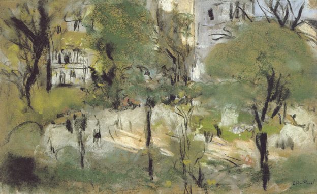
Edouard Vuillard
Place Vintimille. View from the artist’s apartment around 1915
Pastel 31 x 50 cm. Switzerland. Private collection.
Photo from the collector.
Reproduction taken from “Pastels” by Geneviève Monnier, Edition Skira
In this rather spontaneous pastel by Vuillard, the different superimpositions represent the rustling of the leaves, bird calls, the light moving…!
On a greyish brown support, whose original colour appears to still exist at the base of the work, there are some fine layers of pastel, superimposed, blurred, marked by vivid black punctuations of trunks, branches and branch-people!
Some lively and evocative touches develop the background of the composition: the appearance of buildings, the bluish tonal values, a corner of blue sky, the sunny perspective… In the foreground, the square, a mirage of yellow ochre light, haloed by impacts of snowy white pastel and pearly glints produced by the previous layers, is given rhythm thanks to the silhouette of the trees.
The substance of the foreground nourishes the rustling greenery of the central tree, with its hieratic trunk. Through the leaves we can just make out the echo of the background under a layer of unevenly spread green pastel, structured by several black musical notes, one of which is spinning on a bright flat area of yellow that gently brushes against the green. Or again, at the top of the tree, is the sparse green foliage allowing the grain of the paper to show through the greenery?
The tree on the left, with all the force of the top of its crucifix-shaped trunk, appears to surge forward as if it is levitating out of a hazy yellow ochre and blurry green efflorescence.
The tree on the right is walking. It’s tip has become opaque like velvet that has been rubbed with green pastel, then sprinkled with yellow ochre pastel. The texture of the two superimpositions dissimulates, but still allows us to make out the framework of an underlying venous tracery. Branches the colour of a purple martin, emerge bare from the foliage, prolonging the structure of the trunk and the lower branches, drawn with urgency in black pastel, sometimes highlighting the lines of the original sketch.
Given the spontaneous nature of the technique, the lightness of the flat blocks of colour, the superimpositions restricted to three colours by layer, the incisive graphic elements reinforcing the rather rushed flat tints, the restrained palette (green, yellow ochre, blue, and black and white), methods that make the powder stick to the support like a fusion of colours or stumping, such an economy of means implies a work that has a solid foundation and one which a priori doesn’t need to be consolidated with a fixative.
Plunged into the fleeting light of the square seen from the sky on the wings of a bird! Paint with emotion and the material will adapt itself!
Observation of a pastel by Riopelle
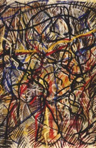
Jean-Paul Riopelle
Pastel
Untitled, 1968. Private collection. Photo Maeght Gallery, Paris
Reproduction taken from “Pastels” by Geneviève Monnier, Edition Skira
For me, a canvas is never the reproduction of an image. It always begins with a vague feeling, the desire to paint. No real graphic idea. The painting starts where it wants… then after, everything follows on from that. That’s the essential thing … Riopelle
Isn’t this “vague feeling, the desire to paint” evoked by Riopelle the universal motivation for artistic expression, desire? We dive into this “wave” as if we were diving into the waves of the ocean, triggering both the action of survival and that of the indescribable joy of just drifting into the unknown. The material becomes at one with the swimmer who works instinctively, intoxicated by the endeavour!
Riopelle puts the “essential” into practice in his work. His desire to paint will quite naturally secrete his technique. This dense pastel, woven from an interlacing of lines, feels like the welcoming texture of a long-pile rug and surprises us with the enigmatic nature of its multiple interlaced lines. From a network of radiant hatchings, defined on the flat tints and light rubbings, wind, unwind, lines drawn freehand in pastel and then dabbed with cotton wool to get different effects.
The contrasted accumulation of nonchalant outlines on the jagged geometry of the hatching, draws us into the dynamic of a kinetic world of undulating vibrations that conjure up a multitude of universes: the mystery of the unconscious, blood circulating, water and fish, lush vegetation, rainstorms and, inscribed into the movement, like the self-portrait of the painter, engraved into the lines of the large-format work, probably without him even knowing…!
Given the entanglement of lines, it might seem that the work has accumulated many layers of pastel even though the superimpositions are full of tiny gaps. It is the undulating lines that make the matter palpitate and not the flat areas of colour.
All of these lines are placed on a background scattered with light touches of pastel that become one with the paper support: a touch of yellow ochre, some bluish greys, some retouches too! A minimum of matter, just enough to give us a glimpse of the areas of the support that are not covered in pastel.
A textured base like this guarantees the future pastel will adhere well to it. And so the lively sharp hatching intertwining with the lazy meanders will bite into the paper well, and have fun with the two graphics, playing at one overlapping the other …
Some lines look like they have been done with wet pastel or with a brush impregnated with pastel powder, which produces renewed matter and manner, whilst at the same time reinforcing the fixation of the powder to the support.
At the point where they come together, these streaks come alive, feed off their mutual complementarity. A light yellow line, crossing the dark coloured lines becomes completely transparent at the overlapping point, a darker one, through its opacity, dominates over the lighter lines whilst at the same time framing the bright planes that they produce, a red takes on the colour of dried blood or rubies depending on whether it crosses a darker line or a yellow one …
And the retouched areas where the pastel is saturated, where it slides out of control, like a white snake on a shadow, only serve to add to the lyricism of the work!
……………….
J“I could say a lot of things about pastels, but I know that the success of a work is about more than just the crayons or paper used by the artist. Recipes are good instructions for painters, but the material work is just a secondary aid.”
(Vianelli, quoted in Rosalba Carrierra’s diary. Published by Alfred Sensier, 1865)
Taken from « Le pastel » by Geneviève Monnier, Edition Skira